Digital Marketing - Study Notes:
The importance of web design
Why is website design so important?
- First impressions: Your website is going to give the first impression to your visitors of your brand online. So, a high quality, well designed website is going to be your initial business card or introduction to your visitor and potential customer.
- Information: It also provides information about your products and services. It's going to be information that's organized in a way that makes sense, and it's going to give visitors what they're looking for, hopefully helping them find a solution.
- Navigation: It's going to have really great navigation, so the user can find information that they're looking for really easily. They don't have to get confused or go to a page and go back because they didn't find what they were looking for. A really great navigation is going to prevent that confusion.
- Content: This is really important with website design because it deals with the layout. So, when the content is laid out really easily, then it's easier to read and users are going to spend more time on the site, and they're going to be able to digest and enjoy the content more.
The key aspects of web design
So, there are six key aspects of website design.
- Simple design: The design should be simple. It shouldn't be distracting, it shouldn't be overwhelming, it shouldn't make users get distracted and forget why they came. It also needs to be modern and not look outdated, especially in web design, you know, we see new designs coming out all the time. So it's important to be updated so you can keep up to date and even be better than your competitors.
- Easy to navigate: Users want to find the information they're looking for quickly and easily, and a good navigation will do that.
- Consistent information: Suppose you have a deal or a special on your home page, and then on the interior order pages. Users need to be able to find that information and it needs to be the same across any page on the site.
- Usability: The website needs to be really easy to use. So, buttons need to be easy to click on. If they're mousing over something, it needs to not disappear and they need to be able to see what they're doing.
- Consistent design: The About page obviously needs to look the same as your other interior pages. The layout needs to be consistent. And again, that's just helping your website be more reputable through design.
- Concise and honest information: You need to make sure that you're not being overly wordy, and you're also telling the right information, because it's up to you to be a thought leader in your industry and provide really good information to your potential customers.
#1 Simple design
The first one is a simple design. You can see on the left-hand side, is an example of a poorly designed website. As you can see, they used the featured images from their blog post as the top part of their website. And so, it's overwhelming. Users don't really know where to go next. They see so many colors and they just get a little overwhelmed.
On the right, you'll see that this is also a publisher site. But the navigation is collapsible, which you don't have to do, but that's an upcoming trend in navigation with the three lines on the left-hand side of the screen shot. But it has an ad and then it has the top story at the top, and then recommended for you on the side.
So, it's instantly giving them information. The navigation is easy to use when the bread crumbs are expanded from the left-hand side menu. And then, it also is personalizing the information for the user.
#2 Navigation
Next up are navigation examples. So, on the left, you can see this is a bar in Kansas City, in the States. So, on this website, you can barely see the navigation. It's white on a photo background. So, you can't really see what the menu is trying to say. It doesn't really have a call to action above the fold, which means what's shown in the screen before they scroll down. So, you don't really know what you're looking for, and even if you did, it's hard to find it.
On the right, you'll see a tour company, EF Educational Tours. They have a really simple design, which works really well. And the navigation is super easy to understand. So, they know that users are looking for tours, they want to know how the tours work, and then users also, if they have a specific question, they can just click on the question in the navigation and that's going to help them get their questions answered through a support module.
#3 Consistent information
You need to have consistent information. Make sure that what you have on your homepage reflects interior pages. Here is a good example. ModCloth is an online clothing retailer and you can see on their homepage on the left, they are doing their stylish surprise sale.
They do bundle packages of items. And, if you click on that banner, it takes you to an interior page that lets you choose what package you want. As you can see, not only are the graphics the same across two pages, but it's taking me right to ordering the stylish surprise, ordering what I want. I could just click on the dress example and it's going to take me to the order screen with the dress example in my cart.
Easy to use, consistent, and I didn't have to hunt for the sale. It took me right to the pages to purchase, and that's what you want to do with consistent information.
#4 Usability
Next up is usability and making your website as easy to use as possible. This goes hand in hand with navigation as well.
Here’s a good example. This is a local movie theatre site. As you can see, we’re on the Showtimes page and it's for a specific movie. And I can look across the navigation. I can see what location, the date, what movie, and then premium offerings like reserved seats, menu ordering, and things like that.
And then, I can easily select the time I want and then once I select the time, a button pops up that says Add to Cart or Check Out. It is really easy to use, simple, and fast. That's what users want.
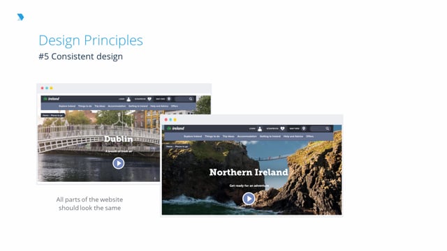
#5 Consistent design
So, consistent design is also really important. The country of Ireland has a tourism website that does a good job of this. All their interior pages about areas in Ireland all look the same.
There's a really cool featured video and then you scroll down and it shows cool areas of Dublin or Northern Ireland and what visitors can do. So, because the design is consistent, when I'm doing research about Ireland, I know where I can look for the information I want on each page, where I can compare. If I was trying to decide between going to Dublin or Northern Ireland, I could compare similar information on both pages to help me plan my trip.
#6 Concise and honest information
The information needs to be concise and honest. So, you don't want to be too worried you're going to lose reader's interest and your customer's interest. So in this example, it's a homepage, but as you can see, instead of focusing on call to actions or what they can do when they get to the site, it just has way too much information that would probably be better on separate interior pages.
You don't want to dump the information on the user and make them feel overwhelmed. You also want to make sure that the information is accurate and easy to read, and it is up to date to the best of your knowledge. That's just important to providing a really good website optimization and user experience.
Back to TopKelsey Jones
Digital Marketing Consultant and Writer
- 9 years’ experience in SEO and writing for the web
- 17 years’ experience in HTML
- Experience writing content for small and large brands
- US Search Awards Judge 2014, 2015, 2016
- The Drum US Search Awards Judge 2017
- Former Executive Editor, Search Engine Journal, 2014-2017