Digital Marketing - Study Notes:
The start of a journey
A website homepage will be the single most visited page on the vast majority of websites. However, only around one third of visits to websites begin there. This is due to the power of search engines and the inclusion in search results of pages other than the homepage.
The ultimate role of the homepage is to provide an effective starting point for all key user journeys, no more no less.
While the homepage may be the most visited page on the website paradoxically, the user may spend the least amount of time on it. For most scenarios the concept of browsing a homepage does not feature as a key user task. In most instances, users want to find the path to their desired content as quickly as possible.
User questions
Users will arrive at a website with questions that they want answered, whether these are expressed consciously or not. The questions may be fundamental and easily answered.
UX designers can gain insight on what a homepage should include through user testing or analyzing data on internal site search. What are people looking for that they can’t find? Perhaps there is a place required on the homepage for elements that appear consistently in these internal site searches.
Example user questions
So what kinds of questions might a user come to the homepage with? As mentioned, these can usually be easily answered, but very often they’re simply not.
Let’s look at some typical examples for an e-commerce website. A user may be asking themselves, “Can I find what I’m looking for? Can I find something that interests me? Do I really want these products? Can I get them at the right price?”
But at the heart of all these questions is the recurring one on the topic we keep returning to, “Can I trust this company?” Most of the other questions are answered in a straightforward manner like pieces of content. The answer to the last one is multifaceted, as we have seen so far.
Supporting the business
The stated business goals for a website as a whole need to be reflected on the homepage. This will require careful prioritization and handling of content.
However, as the homepage represents valuable screen real estate for organizations, internal competition for representation may be high. This can expose some of the departmental friction mentioned earlier in the module. Very often, this can lead to the inclusion of a carousel or slideshow on the homepage, purely to keep every department in the business happy by having them represented on the homepage.
The core proposition of the business needs to be established from the homepage in either unambiguous text or an effective use of photography. The top tasks and goals of users also need to be considered and provided for.
Let’s look at a couple of very different examples of homepage design.
Example: Ineffective design
In this example, taken from a university in the UK, the homepage is dedicated to the Vice-Chancellor’s Distinguished Lecture Series.
This is how this website appeared during a very important time in the university calendar. It was in the months leading up to the application period for universities, and the primary audience for the website at this time would have been prospective students.
And yet, we have to look very hard indeed to find a suitable entry point for that audience. This is a case of getting priorities and content decisions wrong. (In the months since this screen grab was taken, the site has since been updated and features a much more relevant initial proposition to site visitors.)
Example: Effective design
In this example, you’ll notice that the homepage content is a lot sparser. While there is a major promotion in effect, this is not part of the carousel. The company has been able to decide on the most important content and go with that alone.
Crucially, the key tasks of the user are front and center on the website. The mechanism to search for flights is easily discernible and the user will not need to work too hard to do what they came to the website for. The promotional banner may or may not interest them but regardless the top user tasks are well represented here.
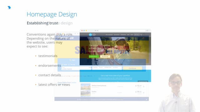
Establishing trust
Returning again to the recurring theme of trust, a user’s degree of trust can mean the difference between the user leaving the site within a short space of time or becoming a loyal customer.
Content elements on a homepage which promote trust can include:
- Testimonials from existing customers or clients
- Easily located contact details
- Endorsements or membership of professional associations demonstrating a company’s standing in its industry
In this example, note the use of imagery, which is included without overpowering the main call-to-action buttons on the page. The image is also of a human face, which has been proven over time to increase engagement with users.
Reflecting updates
One key expectation users will have is that the website homepage will reflect up-to-date content. This is crucial in reflecting the vitality of the business or organization behind it. Content elements, which improve the contemporary appeal of a homepage, can include recent new story summaries, links to recent blog posts, or integration with active social media channels.
On that last point, it is important not to try and reproduce social media content in total. Websites and social media are very different channels. Websites should not simply be a vehicle for social media content but rather reflect the activity on those channels in a reduced format. The homepage should give priority to the most important user journeys. In this sense, it acts as a springboard to other content and is not an end in itself.
Prioritizing tasks and content
The homepage must provide easy access points to top content and top tasks, and should not try to reproduce too much internal content. Users will need enough of a sign post to start them on their particular journey after which the website can begin to offer them much more specific information relevant to their needs.
Common pitfalls
In the earlier years of the web, the homepage was seen as being the single most important page on a website from which all success would spring. That is clearly now not the case for all the reasons we have detailed already.
Dedicating too much design time or too much resource to a homepage design at the expense of other key content pages will be a mistake. It may be that the most important page on your site will be the contact page or the payment page. That is not to denigrate the role of the homepage but simply to keep it in context.
Using the homepage solely as a marketing tool or as a billboard for campaigns, is to the detriment of usability, and is counter to the user centered approach that a good user experience demands.
Back to TopRick Monro
Rick Monro is UX Director at Fathom. He has extensive experience in user research, interaction design, user-centered design, and design strategy with private and public sector organisations throughout the UK and Ireland.