Digital Marketing - Study Notes:
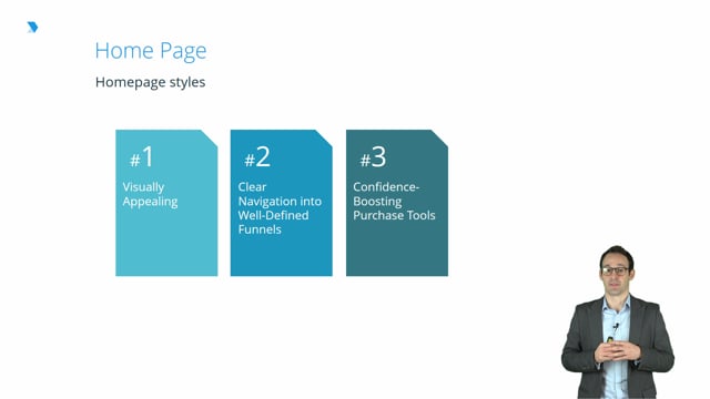
Let’s look at some of the specifics of a crucial page of your website, the homepage. This is like your store window, and so it’s your first impression that people have of your brand. And so it’s important that you get things right here.
Visually appealing
One of the most important points is that it’s visually appealing and that it visually represents your brand. People are very busy, they’re going to move quickly, and so don’t assume that they’re going to read all of the messages and all the words that you’ve put on your page. A lot of the time, they’ll have a very quick, instant reaction to what your page is all about, and a huge influence of that will be the visual appeal. So, make sure that if you want your brand to be loud and brash and bright, that you use colors that reflect that. Conversely, if you want to be relaxing and classy and suave, again, you use colors that reflect that.
Clear navigation to well-defined funnels and categories
The way that you do this will depend on how wide your product offering is.
Small range
So, let’s take an example of a website that sells a small range of products. There’s a popular website in the UK, or a website that I’m quite a fan of, called Mahabis that sells slippers. So, that’s spelled M-A-H-A-B-I-S .com. So, effectively, they’ve got a very small offering of products. They offer slippers and then a few accessories. So their website is very clear, has very minimal menus at the top and at the side of the product. And so, most people will navigate to the category page and to the product page through clicking on the main images on the body of the homepage.
Larger range
Considering a different website that has slightly wider product offering, and Royal & Awesome would be a good example of this, where we’ve got pants, shorts, hats, belts, polo shirts, etc. We have each of those images on our homepage, and a small percentage of people do click on those images to navigate through to the category page. However, we also have a menu bar at the top that has each of the key categories listed there. And that’s the most popular way and the most straightforward way for people to find the category that they’re looking for. Because they don’t have to scroll up and down the page, they can just see the categories listed at the top.
Much larger range
Moving on to a third example of a website that has a much bigger product range, and again, the Morphsuits site would be an example of this, and of course, the biggest retail website of all, Amazon, would be another example of this. Where it does have a menu bar at the top, but it can quite quickly become difficult to understand which of the roots on the menu bar is going to get you to your chosen product most quickly. So, they will have a very prominent search bar at the top of the site, where you can very easily type in what you’re looking for and you’ll be shown a list of products that closely matches that search.
So, to sum up, you want to have a range of options that allow people to very quickly find the product category or the specific product that they are looking for.
Confidence-boosting purchase tools
Remember that a lot of the time people come to your website, they won’t know much about your business. And so as a result, they might be a little bit nervous about whether they should choose you versus some of the competition and whether they can have confidence that their credit card details are going to be safe with you and that the product they are going to get is going to be of a high quality. So, anything that you can do to convince them and to take away that fear and that nervousness is a good idea.
Social proof
Showing them that lots of other people are buying products from your website. So, you’ll quite often see on websites claims like, “1 million books sold,” or, “Join the 25,000 customers that are already using our service.” And again, humans are herd animals, so all of this helps people think, “Well, if all those other people are doing it, it must be a good idea.”
Logos
Other things you might see to boost confidence are logos from businesses like Trustpilot or other review softwares, and the rating that the business has got. Again, say, “From a third-party business, we reviewed how good these products are and how good this website’s services are, and we’ve given them this score.” Likewise, you might see endorsements and references to different websites and to different media outlets. So, it might say, “New York Times Bestseller,” or, “As reviewed by the Guardian Newspaper.” And again, these endorsements all give people confidence that it’s a well-established website.
The final logo you quite often see, and it’s worth considering putting on your homepage, are things like ‘Norton Antivirus’ and ‘PayPal Approved by’. Things like that that let you know that, first of all, you’re not going to get any nasties through the site, and secondly, that if you do put your credit card details into the site, they’re going to be well looked after.
So, again, it’s all about:
- Making it visually appealing so that it reflects your brand
- Making the products easy for people to find through the homepage
- Giving them confidence that yours is a reputable site worth buying from
Organic traffic
Now let’s look at organic traffic and the role that that plays with the homepage. The homepage will be the most likely place that people come from organic traffic, but it doesn’t need to be the only place.
Organic traffic is the traffic that, when people have searched into a search engine, some sort of search for what they’re looking for online, they’ll usually be shown some adverts and then below that they’ll be shown a list of websites that that search engine, in most cases Google, has ranked as the most relevant pages for their search.
So, in a lot of cases, the page that they land on will be the homepage, and that’s why it’s so important. But it doesn’t necessarily need to be. So, if someone is searching for ‘pair of size nine black hiking boots’, for example, that’s a very specific search, which indicates to you that they know exactly what they’re looking for and so it makes sense to show them either that exact product or a range of products that fit that bill so that they are closer to the end goal for them of purchasing a product, and also your end goal, as a website, of selling a product. Rather than putting them in on the homepage and then hoping that they navigate through all the different phases to find that product.
Likewise, if you take a website that’s a two-sided marketplace, for example, so the likes of Airbnb, you’ll often get people who are searching for information that relates to being a host on Airbnb, or, conversely, they might be searching for information about being a guest at Airbnb. It makes sense to have a page that is optimized with the information that is relevant to each of those two different audiences and direct traffic onto that page. So, it’s all about understanding what your consumer is looking for and showing them that relevant information.
Back to TopGraeme Smeaton
Graeme Smeaton is the founder of Royal & Awesome. Along with a proven track record in defining and delivering marketing strategies that drive significant growth and create real shareholder value, Graeme is highly commercial. He has extensive experience managing PLs and other key financial statements, while being an operational board director of AFG Media Ltd, and has experience negotiating with suppliers, distributors and licensing partners.

By the end of this topic, you should be able to:
- Identify the channels and formats used to generate e-commerce customer interest including e-commerce websites
- Analyse user behaviour on an e-commerce platform
- Critically assess opportunities for creating e-commerce conversions