Digital Marketing - Study Notes:
The basics of effective copy
Copy is basically the content on your website. That could be your homepage, your About page, services, products, everything that's going to give users information about your products and services.
Clear
You want your copy to be clear.
“We offer air conditioning units to restaurants and hotels.”
So in the example, we offer air conditioning units to restaurants and hotels. That's not confusing. It's not using overly flowery language that's going to confuse the user or make them feel put off or they don't know what you're talking about.
Enticing
So when they say copy needs to be enticing, you want to say something that piques the reader's interest, and going to make want to click through a completed conversion or learn more about your products and services.
“We offer award-winning, certified air conditioning units to restaurants and hotels. No other competitors offer our same 10-year warranty.”
So in this example, we offer award winning certified air conditioning units to restaurants and hotels. No other competitors offer our same 10-year warranty. So that's basically providing users with what they'll get if they go with your company.
Unique
You also want your content to be unique.
“No other competitors offer our same 10-year warranty.”
You want to point out what makes you different from your competitors and what you offer that other competitors aren't. That way, users know what to expect when they decide to go with your company.
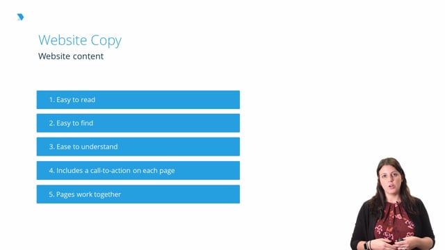
Website content
Every page on your site should have five things.
Easy to read
It needs to be easy to read so the content is broken up effectively into smaller paragraphs. You use headers to break up the content so it's easier to digest, just making it easier for the reader to stay on the page longer.
Easy to find
That goes a little bit into SEO, but also goes into proper website architecture and then optimization. So, they want to be able to find what they're looking for in just a few clicks. If I go to your homepage, I should be able to see what services you offer just in a few clicks. I should get the detailed information in a few seconds.
Easy to understand
The information also needs to be easy to understand. Even if you have a really technical product or service, you need to break it down at a lower reading level just so people can understand. Maybe they're going to be new to your industry, or new to your product, they don't know what they're looking for, you need to make it easy to understand so they'll be able to engage with it and hopefully, complete a conversion on your site.
Includes a CTA on each page
A call to action (CTA) is also very important for every page on the site. A CTA is basically something like, "Contact us today, or call now to learn more, set up an appointment, send this to your email, sign up for our newsletter," anything that's having them complete an action, which can be a conversion on your site depending on what your site scores are. That's important to have on every page because you want to give them as many places as possible to complete that conversion.
Pages work together
And then finally, all the pages should work together. You should have pages linking together when they make sense. Let's say had a Services page about my writing services and I mention my graphic design services. In that case, I should be linking to my Graphic Design Services page. So just making sure that the copy is linking and we're referring to each other and working together in order to be as effective as it can.
Make sure to include CTAs
For a CTA:
- Use a clear, concise command: You want to use a clear, concise command that has direct language. You don't want to say anything like, "Please call us" or, "If you want" You want to say, "Click here, buy now" direct actions that are going to spur the reader into action and actually make a decision.
- Highlight how the offer benefits the user: You want to make it impossible to resist. You want to make it hard for them to say no. So, you know, "Buy now and you'll get this for 50% off." Just kind of show what they get immediately if they buy something from you, or sign up for more information on your site.
- Show social proof: You also want to show social proof. So one thing that works really well is that it'll say, "Join 10,000 other email subscribers, sign up for our newsletter today." I see that and I think, "Wow, 10,000 other people have signed up for the newsletter, what am I missing out on, I should sign up too." And that's just showing people that other people believe in your product so they should as well.
- Show sense of urgency: Maybe this offer is only available through the end of the month, or only available for 48 hours. You want to make sure that they are kind of rush, they feel a little bit pressure to complete the conversion. Maybe it won't always be there, the offer, or the deal, or what have you. So you want to make sure that that's going to spur them to complete the action that you want.
Creating a cohesive experience
You want to create a really cohesive experience.
- Home page: That means that all the pages are going to be offering the same information. Like in the ModCloth example earlier, the same sales that you offer on your homepage, you should also be offering on interior product pages.
- Messaging: The key messaging should all be the same. So if you have a tag line, or a mission statement, that should be the same across all pages, maybe your values should be reflected in all the work you do and all the services you provide.
- Tone and voice: The voice and tone also needs to be the same. If I was speaking in first person (“You should do this.”), it should be like that on all the pages on my site, and not switch to the third person (“The business would enjoy this.”) So, make sure that that's the same. It's all little things like that that just create a better experience for the user.
- Navigation: You also want to make sure that pages are linking well with the navigation, with the interior pages just providing that good experience that all works together.
Kelsey Jones
Digital Marketing Consultant and Writer
- 9 years’ experience in SEO and writing for the web
- 17 years’ experience in HTML
- Experience writing content for small and large brands
- US Search Awards Judge 2014, 2015, 2016
- The Drum US Search Awards Judge 2017
- Former Executive Editor, Search Engine Journal, 2014-2017