Digital Marketing - Study Notes:
Lo-fi prototypes
In this example, we have a low fidelity wireframe. As you can see, this is a very simple layout showing the main content blocks on the page, where the visual emphasis should be, for instance any calls to action that need to be highlighted for the user.
Using something as simple as this, we can adequately communicate a basic layout, a visual hierarchy, and relative priorities on the page. We can also indicate different media types, such as video, text content and images, as shown here. These can begin to prompt early feedback or gain broad agreement on the direction the design needs to take before too much time is invested in rendering the page in any great detail.
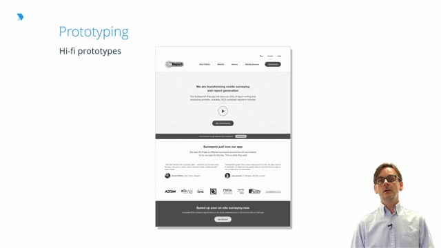
Hi-fi prototype
This is the same page rendered in higher fidelity.
In this version, we’ve started the process of filling in the design with greater detail, including the style and amount of copy appearing at various points on the page. Again, while images have begun to be represented and some modest styling has been added, discussion and feedback should continue to be focused on the fundamental elements of the page, rather than becoming fixated on brand or visual design.
That’s the real strength of wireframes, and UX design in general:
- Removing subjectivity from the discussion
- Ensuring that what is being offered to the user reflects the goals for the project without the distraction of what shade of blue or red should be used in the design
Rick Monro
Rick Monro is UX Director at Fathom. He has extensive experience in user research, interaction design, user-centered design, and design strategy with private and public sector organisations throughout the UK and Ireland.