Digital Marketing - Study Notes:
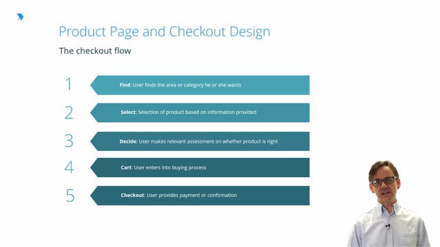
The checkout flow
Again, taking e-commerce as our example model, the category page forms the first step on the path to conversion.
Here we have broken down these steps as follows:
- Finding: A user identifies the right category of product for them.
- Selection: The user selects an individual product.
- Decision: The user assesses the product based on key criteria which means their criteria.
- Cart: The user makes a conscious decision to proceed with a purchase.
- Checkout: The user follows through on their purchase.
Selection: Creating a conversion
Individual product pages represent the point at which most users will decide whether or not to purchase an item they are considering.
User queries at this level of a website will be highly specific and informed. Failure to answer these queries may drive the user to a competitor, a behavior we will all recognize.
Options offered to the user at this point should become limited and restricted either to purchase or to the retrieval of information that may lead to the purchase.
Example: Ineffective design
Let’s look at an example of a badly rendered product page.
The dominant element on this page is a paragraph of text. While as a user I can see the price, the images shown would not excite or inspire too many users. Where is the delivery information? Why is the page so oddly laid out?
As you look at this page, again consider the themes of trust and credibility that we have returned to throughout this module.
Removing barriers
At product page and checkout stages, barriers to conversion are all too easily created.
Common barriers to conversion can include:
- Obscure Add to cart buttons
- Lack of visible payment options
- Obscuring of key information on delivery or other additional charges
- Poor product presentation
- Lack of product reviews
- Forced registration in order to make a purchase
Example: Effective design
So what should a product page look like? Here’s an example product page that gets most of those elements right.
The price is clearly displayed. Shipping information is also displayed adjacent to the price; in this case, it’s free. A review summary in terms of number of stars is shown beside the product name. The ‘add to cart’ button is highly prominent on the page. Summary information is displayed with an option to reveal more if the user requires it. And the product imagery is of a high quality and there are multiple views available.
All of these help to form a better view of the page by the user.
Confirmation and reassurance
Shopping cart, or basket design, is as important as the design of any other webpage. This is not something that should be left to default settings of an e-commerce platform or package.
The cart, or basket, is one of the last wait points for a user on their path to purchase, and as such, it should offer nothing but reassurance and confidence in the purchase.
Components in an effective cart page can include:
- A summary of user selections to date
- A clear call to action pointing towards checkout
- The ability to alter quantity or remove the product
- A full price breakdown
- A clear total cost of the purchase
On these pages, while there are any number of options the user might take, the action to proceed to checkout should be the unambiguous, primary action for the user.
Managing complexity
The design of a checkout process can influence a conversion or purchase right up until the user has completed their order. Checkout steps correspond to the main stages in a website conversion funnel, which detail where purchases have been abandoned. Conversion funnels, built up through analytics on a series of webpages, offer valuable insights into where users have abandoned their purchase. Usability testing can supply the ‘why’.
Elements which contribute to cart abandonment can include:
- Badly laid out steps or screens
- Poor feedback offered to the user about where they are in the checkout process
- Superfluous or needless screens which offer the user little or nothing
- Poor user guidance around what the purchases will entail and what information they will be required to input
Rick Monro
Rick Monro is UX Director at Fathom. He has extensive experience in user research, interaction design, user-centered design, and design strategy with private and public sector organisations throughout the UK and Ireland.