Digital Marketing - Study Notes:
What is UX design?
In defining user experience, it’s useful to think about what it is and what it isn’t. This is a quotation from Apple founder Steve Jobs in an interview he gave in 2003 about the origin of the iPod, which had a profound effect, not just on Apple’s fortunes at the time, but in how people perceive technology and in how they should interact with it.
To give this statement its full context, Jobs full quote was this:
“Most people make the mistake of thinking design is what it looks like, people think it’s this veneer that the designers are handed this box and told, ‘Make it look good.’ That’s not what we think design is. It’s not just what it looks like and feels like, design is how it works.”
Nielsen Norman Group are one of the world’s largest UX consultancies, and they have defined user experience in this way:
“User experience encompasses all aspects of the end user’s interaction with the company, its services, and its products.”
You’ll note how broad reaching and comprehensive this definition is. It mentions all aspects of the end user experience. Clearly, this goes well beyond a simple interface. We all become end users as we begin to interact with a product or service.
Wikipedia similarly gives a far-reaching definition, echoing the words from Nielsen Norman Group:
“When any one of us sit down in front of a computer, lift our tablet or mobile phone and visit a website are use an app, we have become users of a service. Every interaction we have with the website from our initial impressions through to leaving the site and our recollections of it afterwards all contribute to the user experience we’ve had.”
UX in the real world
Let’s look at an example from the real world.
Sometimes we seem to want to go out of our way to confuse people. In this example above, which is an entrance to a public building, we have told people two things they shouldn’t do. And this of course begs the question, “Well, what should I do?”
We need to appreciate that people don’t like to be made to think too hard about things, particularly when it comes to online activity. Digital is supposed to make our lives easier, so why would we ever consider doing the equivalent of this online. And yet, it happens more often than you might think.
Before we get into design for the web specifically, let’s look at another real-world example in a little bit more depth.
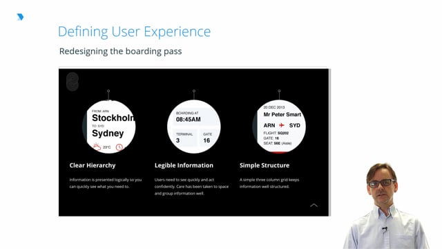
This example comes from a designer in the US called Pete Smart. Over a period of two months in 2013, Pete had been on 13 different flights and he noticed something that many of us might overlook. He noticed that boarding passes were by and large very badly designed.
Pete didn’t stop there! He thought about and defined the problem he was having with the boarding passes. He looked at the collection of strangely ordered acronyms, oddly formatted times and sequences that required a lot of effort to decode and understand. He felt this should be a lot easier to use and that boarding passes should ease stress for the traveler, rather than adding to it. So he went about redesigning the boarding pass. And this was his result.
You’ll notice firstly the switch from the familiar landscape format to a portrait format, and importantly, Smart set himself some constraints.
In terms of information, he felt the solution should try to include all of the information carried on existing boarding passes. In terms of format, the result should use the same standard dimensions of the existing boarding passes also. Finally, you should be able to print using only black ink and to not increase the cost of printing for airlines.
Smart included a clear hierarchy of information. The content on the boarding pass is presented logically so the passengers can quickly scan for relevant information. Care was taken to space and group information well, and he retained a simple three column grid to keep the information well structured. He also thought about information that would assist the user after their journey, such as whether they might need their coat at the other end.
And finally, Smart included nice touches to make the boarding pass more usable overall. If the boarding pass is folded along the line of the tear-off strip, the boarding pass can then fit comfortably inside a passport and the key details of the flight are available at a glance without having to constantly open and close a passport.
So while the solution is great, consider the approach to the problem that Pete Smart took. He questioned what has been in use by countless passengers in order to create a better, more usable output. This kind of approach using design thinking is applicable in all sorts of contexts. By asking the right questions, by defining the problem more clearly, we can create better experiences for users and consumers.
Back to TopRick Monro
Rick Monro is UX Director at Fathom. He has extensive experience in user research, interaction design, user-centered design, and design strategy with private and public sector organisations throughout the UK and Ireland.