Digital Marketing - Study Notes:
Providing for a more specific audience
A category or landing page must meet the expectation the user had when they clicked the navigation item that led to it, if they came from within the website. These pages will be very common entry points to the site for many users, due to specific searches they have performed in search engines, and as such it must similarly meet those expectations.
These pages, usually appearing at the second level of a website, allow users to begin to identify themselves as having a particular interest or requirement. And content will need to reflect that need or interest.
An effective landing page should put the user in control of content, for example, by providing filtering controls or more specific search mechanisms within a product category. These pages must provide effective sign posts to the content available within that section and offer a clear means to access it.
Providing the users with what they need
As users commit to certain user journeys they reveal themselves as a particular type of user with more specific interests. Content should match those interests accordingly.
Design patterns which users may expect to find on these pages can include:
- Product or service listings
- Simple presentation of the options available within this section
- Filtering tools, if they are looking at subcategories of a product
- Secondary navigation, allowing them to browse or navigate laterally within that section
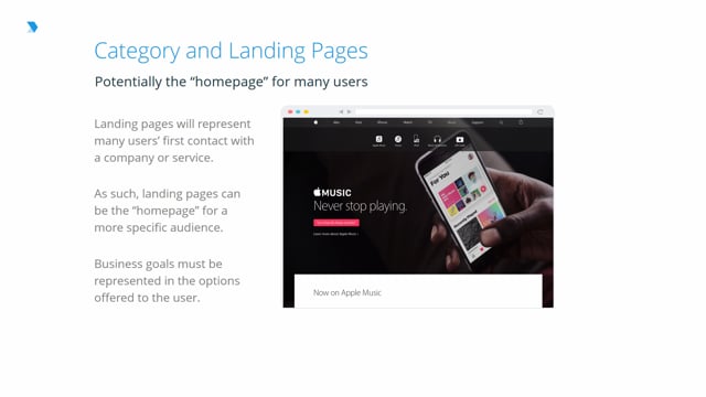
Home page for many users
Just as with the homepage, business goals also apply to these pages, as they involve an organization promoting specific products or services.
Facilitating business goals on category pages can be furthered by the following techniques:
- Grouping similar products or services
- Offering the right tools to narrow options available
- Changing the tone of content to appeal to this more specific audience
Also, homepages, category or landing pages will rarely not be suitable for inappropriate marketing or advertising.
Example: Effective design
Let’s look at a simple example. In this case, as a user, I have arrived at the men’s section of an online clothing retailer. I’m immediately presented with content that is relevant to my request to see men’s products. And I am now equipped with tools in the left-hand column to continue making my query increasingly specific.
Note the use of images here, which are highly appropriate given the subject matter. Also note the lack of other visual clutter. Products are front and center and my key tasks are facilitated.
Back to TopRick Monro
Rick Monro is UX Director at Fathom. He has extensive experience in user research, interaction design, user-centered design, and design strategy with private and public sector organisations throughout the UK and Ireland.